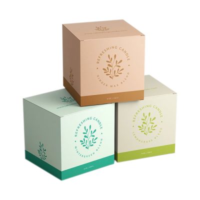
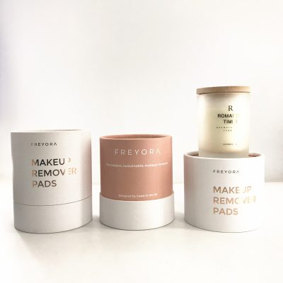
This is the most frequently used color in the current packaging design and the most widely used. It is very common in many graphic designs (referring to posters, hanging paintings or situation binding). The so-called contrast of shades should mean that the shades and shades of the design colors appear ingeniously on one screen at the same time, resulting in a more coordinated perspective effect. Usually, a large area of light-colored base is used, and a dark composition is used on it, such as a pale yellow base, a coffee-colored base is used for composition, or a light yellow or white pattern line is used in the coffee-colored color block; also such as Use a light green base; a dark green composition; a pink base; a bright red composition; a light gray base; a soapy black composition, etc. These are the shades of color used, and we can use this form in the packaging design of some cosmetic packaging or some Western wine packaging, especially Western European wine packaging is the most common. China’s Changyu wine and Shuanghui-style sausages and Xijie’s meat product packaging are mostly expressed in this form. This form of packaging is also common in Japan and South Korea and Taiwan. The visual effect it shows is bright, simple, gentle and elegant.


